Say goodbye to the old Forks logo and all that teal! You have probably noticed, but The Forks has seen some changes in the last few years, and we want our visual identity to keep up with that.

Our old look was a staple in the city and served us SO well, and now it's time for something fresh and new. We hired Tetro Design to come up with something that lived up to both the history of the space and the modern updates.
Here's what Mark Reimer from Tetro Design had to say about the process...
---
Over the past few years, The Forks has undergone an amazing transformation, kickstarted by the Forks Market renovation and the addition of The Common. These upgrades not only revitalized the space, but represented renewed energy at Winnipeg’s premier meeting place.

We at Tetro were tasked to develop a refreshed look and feel that would reflect this new vision of The Forks – one that would appeal equally to locals, tourists, and continue to serve businesses at The Forks. At the same time, we had to consider the wide variety of partner brands that live at The Forks, such as events, retailers, restaurants, seasonal attractions and more.
Our goal was to develop a brand that was modern and compelling, yet still respected the broad historic nature of The Forks – from Indigenous meeting place, to fur trading post, to rail yard stables. The new logo and brand would also need to compliment the new Market and Common brands, and act as a unifying umbrella for various sub-brands. We wanted there to be a clear relationship between The Forks and The Forks Market/The Common. Something that felt related, but not like twins.
And no teal.

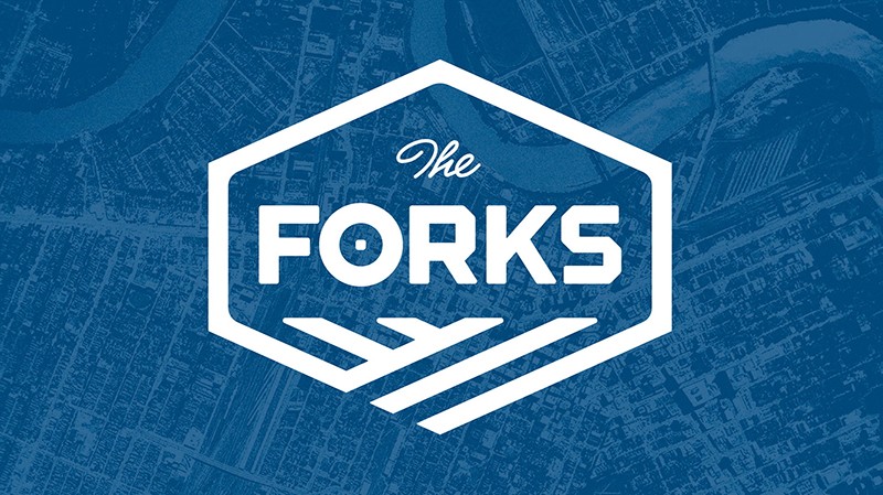
Our logo design represents a contained and classic mark.
The intersecting lines represent the convergence of the Red and Assiniboine Rivers. They can also represent the landscape – the early land plots along the riverbank, the alignment of the former buildings when the site was a rail yard or a meeting place.

The style is consistent with The Forks Market/Common branding, so there is a natural feeling of connectedness between the logos.
The shape and composition itself is unique. The design feels modern, yet timeless, with a subtle historic reference.
---
A huge thank you to all of our partners who helped bring this vision to life – Tetro Design, Handcraft, and Visual Lizard.
---
Other posts that might interest you: