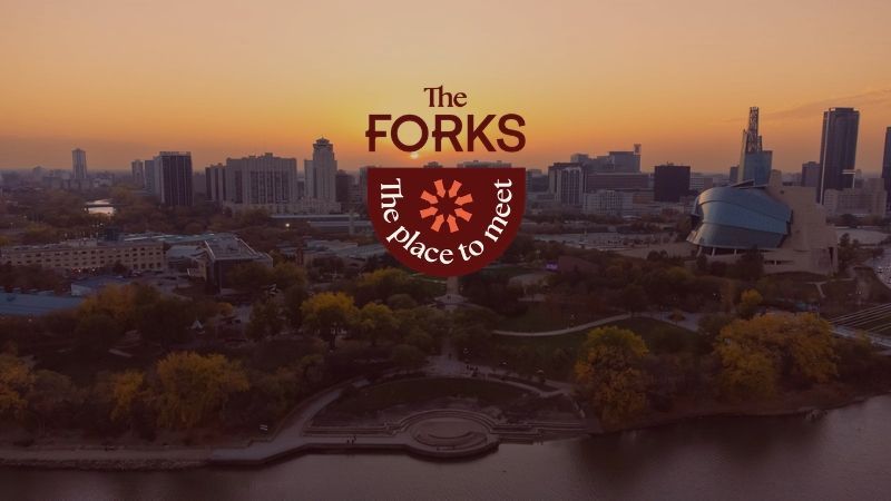
New look, still the place to meet
The Forks has always been defined by the people who gather here.
This idea has guided The Forks for decades, and now it's guiding the next chapter of its brand story.
More than a new look
Today, The Forks is much more than a destination. It's home to The Forks Market, The Common, Target Zero, Nestaweya River Trail, Railside at The Forks, The Forks Foundation, and dozens of programs and events that bring people together year-round.
The new brand is about better expressing what has always made this place special and what makes The Forks, “The Forks.”
There were three key reasons it was time for a refresh.
Growing with The Forks
The Forks itself is evolving. With the addition of Railside at The Forks, the future of Alexander Docks Park, and the ongoing work to reconnect people with the river through Go to the Waterfront, we're entering an exciting new chapter. We wanted a visual identity that reflects where we've come from, who we are today, and where we're headed next.
A cohesive system
The Forks continues to grow with new places, programs, events, and initiatives. We’re excited to introduce a cohesive look that brings everything together while allowing each part of The Forks to maintain its own personality.
Better storytelling
The history of this place is inseparable from its future. Components of the new brand help tell The Forks stories by honouring the people who were here first and ensuring that Indigenous history and culture are meaningfully reflected throughout our visual identity, creating more opportunities to celebrate, learn, and deepen our understanding of this place.
Designed with community in mind
The Forks belongs to everyone, and that belief shaped this work.
We gathered input from partners, Indigenous advisors, staff, board members, and community members, while also seeking perspectives from underrepresented audiences. The brand has been shaped by research, conversations, and community voices to reflect The Forks’ values of connection, stewardship, inclusion, and community.
The goal wasn't simply to create a new logo. It was to create a visual identity that better reflects our values of connection, stewardship, inclusion, and community. And we want to ensure that this is The Place to Meet and that everyone feels welcome here.
Inspired by place
Every element of the new identity has been designed with purpose. Each design choice helps tell the story of this place and the people who continue to shape it.
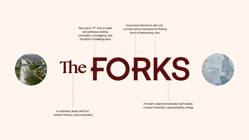
The logo is inspired by the curves of the rivers that meet here.
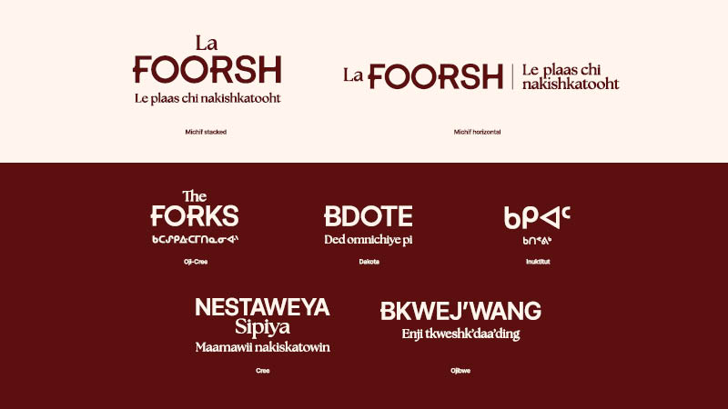
To celebrate and reflect the communities that call Manitoba home, The Forks now has official wordmarks in English, French, and several Indigenous languages spoken throughout our province.
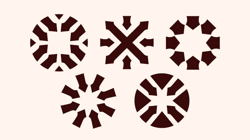
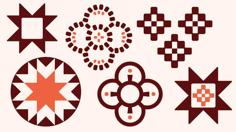
Throughout the brand, you'll notice arrows representing movement, direction, and gathering, along with Indigenous mosaic patterns thoughtfully developed with cultural meaning and significance.
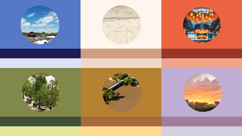
The colour palette is deeply connected to The Forks itself, drawing from rich riverbank soil, prairie grasses, open skies, winter light, and warm prairie sunsets.
Accessibility also played an important role throughout the process, influencing everything from colour choices to typography to ensure the brand is welcoming and easy to experience across physical and digital spaces.
Looking ahead
You'll begin to see the new visual identity appear across The Forks, online, in The Forks uniforms, and throughout our programs and events.
Some things will look different, but what makes The Forks special hasn't changed.
We aspire to be the best hosts to every visitor of The Forks, and the best stewards of this land. If we get it right, The Forks will continue to be the backdrop for millions of community stories for years to come.
Thanks go to UpHouse for designing our new visual identity. We are grateful for their creativity and collaboration, and also thank everyone who shared their ideas, stories, and feedback throughout the process.